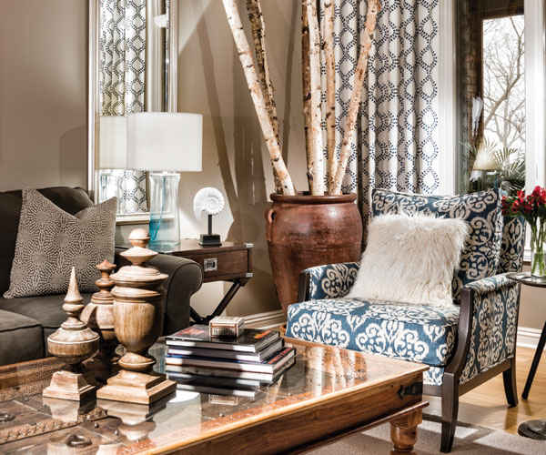
2023 may be the first year after the height of COVID where we can see the light at the end of the tunnel. Design trends over the past few years have been closely tied to the immense changes in our priorities and day-to-day living. If there is a normal, it feels like we’re on the way back to it.
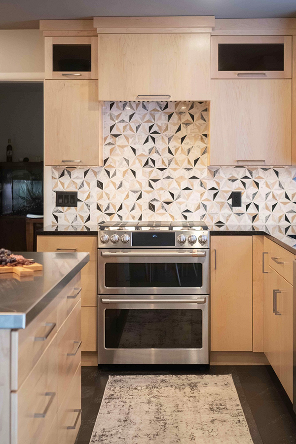
With that in mind, here are a few kitchen design trends that we think will be popular in 2023…
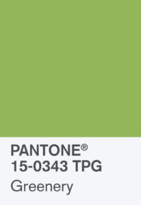
Pantone’s Color of the Year 2017 – Greenery – is a fresh surprise!
The long-awaited “color of the year” from the leader in color forecasting and trends, Pantone®, was released this morning and it is a refreshing change to the neutrals and soft colors of 2016.
Greenery is a vibrant, zesty green that is meant to invoke the newness of Spring. According to Pantone®:
Greenery is nature’s neutral. The more submerged people are in modern life, the greater their innate craving to immerse themselves in the physical beauty and inherent unity of the natural world. This shift is reflected by the proliferation of all things expressive of Greenery in daily lives through urban planning, architecture, lifestyle and design choices globally. A constant on the periphery, Greenery is now being pulled to the forefront – it is an omnipresent hue around the world.
A life-affirming shade, Greenery is also emblematic of the pursuit of personal passions and vitality.
Greenery can be incorpoarted into a variety of palettes and is considered trans-seasonal, meaning this bright green will be as appropriate for Spring as it is Winter. Here are some suggested color palettes from Pantone for interiors, as well as fashion:
I am personally excited to see interiors feature this hue! As a matter of fact, my logo has used this bright green since our inception!
Watch out for more blog posts featuring products in the vivid “Greenery” color!
