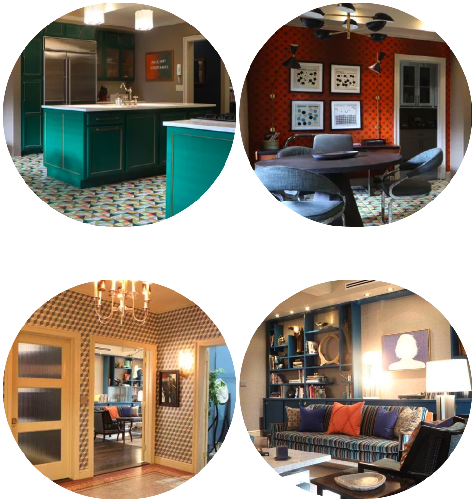
If you have found yourself drawn to any of the apartments in "Only Murders in the Building", it probably says something about your personality. Check out what the design styles of Charles-Haden Savage, Oliver Putnam, or Mabel Mora says about you!
A glimpse into the 2016 Color Forecasts
Every year at this time I anxiously check my e-mail for an announcement of Pantone’s Color of the Year. While we wait, however, both Sherwin-Williams and Benjamin Moore released their 2016 “Color of the Year” and they’re strikingly similar.
And both white.


Hmm. Not sure about this.
“White space”—meaning clear area around a focal point, or space for a element to shine—is an essential element of any design. White space keeps a room’s visual flow moving. Too little white space gives an aura of chaos and clutter. White space does not necessary have to equal literal white. What is most curious to me is the detailed and well-thought-out narratives explaining why their colors (or total lack there-of) should set the tone for the next 366 days (2016 is a Leap Year, by the way.)
Words used to describe these choices are light, subtle, focus, harmony, calm, spiritual, solace and revival. Yet, at the same time, aspects of white are contrast, bold, and a means to bring a heightened differentiation between other colors (sic). So, the undertone of being non-politically-correct aside, white can be whatever you want it to be.
Safe.
While the color-lover in me is screaming ‘THIS IS SO VANILLA!!!!’ … “safe”, in some ways, doesn’t seem like a bad tone to set for 2016.
Pantone® will be releasing their color of the year in the next few weeks and I would be surprised if it followed suit. Colors they have chosen in the past few years have been MARSALA (2015—which, in my opinion, has been a huge, huge hit! It’s been everywhere this year!), RADIANT ORCHID (2014), EMERALD (2013), TANGERINE TANGO (2012) and HONEYSUCKLE (2011).
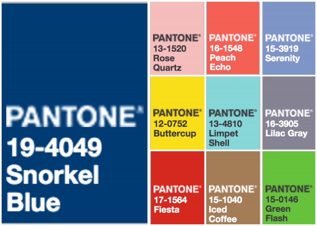
Pantone® has already released their color trend forecast for the apparel industry and it’s full of variety as always. However, there is one color that I predict for their Color of the Year.
Snorkel Blue (19-4049), or a deep royal blue, has been a dominant color at many market shows in the past year. From lacquered furniture to a revival of blue and white dinnerware, this color can easily play the part of either bold accent or deep neutral.
Time will tell.
But if it is Snorkel Blue, I called it first. :)
What are you thoughts on Benjamin Moore and Sherwin-William’s color picks?
Related Posts